

DBS


branding.
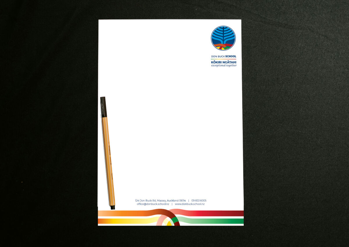
DBS had a logo which had been with the school for a long time. There was some idea of what it may mean – but no clear story or relevance to where they are now and where they’re headed. It needed updating while honouring some of the elements of the original.
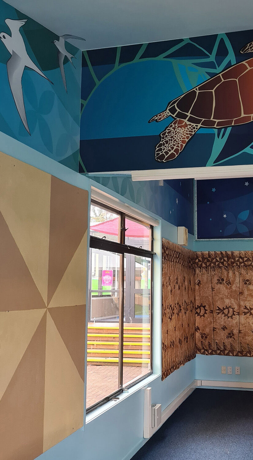
The upper tree portion of the logo was a modification of existing logo – a part the community indicated they wanted to keep. The roots were brought in to represent their school whānau groups weaving together into the school tree representing growth and learning. This root inspired design ended being a key element of their branding and used in everything from letterhead and strategic documents, to a mural on a wall in their playground.
Whānau groups.